A lot has changed with the new website… all to serve you better.
You’ll find the new website to be concise, efficient, but robust enough for customers to go as deep as they need to go, without forcing them to endlessly dig to solve their current need.
The new website was a collaborative effort with a lot of you
Over the past year many of you have worked closely with us and our marketing consultant who we’ve been working with to make our new website , Daniel from Dan Design.
The entire process has been incredibly insightful and rewarding and has finally bore fruit!
Through the early stages of the process, a common thread came out from each of you that resonated with the bank’s overall mission. Those findings drove this entire project.
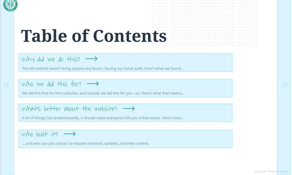
As succinctly as possible, here is the summary of why we did this, who we did this for, what’s new, and how it was all done.
The above presentation deck is interactive.
- You can click anywhere on the slides and you’ll see blue highlights that will show linkable areas.
- You can click on the arrows to navigate to the next or previous slide.
- You can click on “Go to table of contents” at the top left to go there.
- The green titles within the table of contents are clickable.

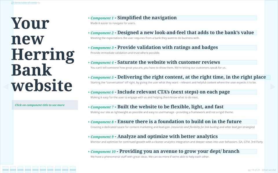
- Within the “Your new Herring Bank website” page that displays 10 components – each component is clickable – each will show you a more indepth view for that component.
- The 10 grey rectangles in the bottom left corner are also clickable.

If you are unable to see the entire deck because of your screen size, you can expand the presentation to full screen.
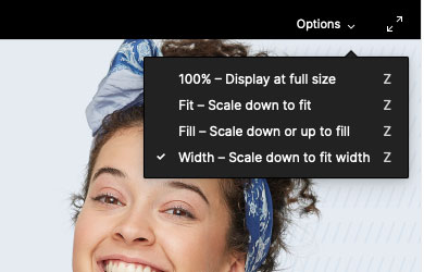
To do so, hover (or tap) on the presentation deck, click on “options” to expand viewing options.

Or click on the double arrow icon and expand the deck to full screen view.

Or, if you prefer, you can scroll down for a brief high-level overview.

Why did we release a new website?
Frankly… if we’re honest, it was way past time. The old Herring Bank website wasn’t doing anyone any favors. It was…
- … disorganized, lacked a cohesive message, and had over 200 orphaned and “broken” live pages.
- … very difficult to navigate and find content.
- … largely tone-deaf and the content was ignoring user intent, lacking details, and not user friendly.
- … unclear what actions the user should take. The call to actions were confusing if present at all.
- … unfocused with a look-and-feel that did a poor job representing the value and strengths of HB.
- … not a useful tool for our staff to use when working with prospects and customers.
- … out of date. The codebase, and as a result the plugins, were years behind which left it vulnerable to exploits, making it harder to manage, and limited any attempt to add new functionality.
- … heavy and slow. It took at least 5 seconds and more commonly up to 20 seconds on average before being fully interactive – causing Google to give it a mobile speed score of 14 out of 100.
The really bad news.
It wasn’t capturing any measurable organic traffic… something we now anticipate to change over time.
For example…
The homepage, online banking page, student banking page, and customer security center page, together, accounted for approximately 94% of all page views. No other page accounted for more than 1% of page views.
Here’s a breakdown of our most visited pages. (over a 30 day period)
#1 – Homepage – 50k total page views with only 20% being new users
#2 – Online Banking – 22k total page views with only 15% being new users
#3 – Student Banking Login – 8.4k total page views with only 37% being new users
#4 – Student Banking – 3.4k total page views with only 20% being new users
#5 – Customer security center – 1.9k total page views with +55% being new users
#6 – Locate a branch – 693 total page views with +60% being new users
#7 – Personal Banking Checking Account – 690 total page views with +60% being new users
(The most viewed page that was a service related page and not a login or contact related page)

Who did we build the website for?
The website is built for our customer first, and our team member’s second.
After rounds of interviews, this is how we define who we are and who we serve, and how those both relate to the website.
Built to be a better representative of us – who we are.
We are a financially conservative, personalized, up-front community bank. We care about the customer and their needs.
What does that mean?
We care about our customers because they are our neighbors – we want them to succeed.
How we view and treat our customers
Our customers are people we care about and like, not just another account number. We ask them about their vacation last month. We drop off doughnuts at their places of business. If someone walks in our door, they’re somebody we know!
Why we care – what’s the strategy?
The vast majority of our new business is referral driven. If the referrals were to stop, we’d struggle.
Since we know our customers so well, we can personalize their service. We can recommend products or other services that will actually help – in turn, they trust us.
Because they trust us, their referrals are warm. When someone refers to us, it’s a high “personal” recommendation, not just a passing of a phone number.
How do we win customers?
We don’t treat customers like cattle, bleeding them for what we can get in fees and upsells that aren’t relevant/helpful.
- – We have a personalized relationship with each customer.
- – We are a close team of bankers – our lenders are aligned with our mortgage dept who are aligned with the wealth management team, etc… allowing us to make better recommendations.
- – We’re proactive in our communication. Our staff give away their emails, desk numbers, and even personal cell phone numbers.
- – History – We don’t close, we don’t default, we don’t over stretch in good times, so, we don’t have exposure during the bad. We’re consistent.
We do things that other banks consider too time-consuming or not valuable enough to consider.
We don’t just give a “no” – we work with the customer to find a way.
If a yes is possible, we’ll get there. We’re creative and resourceful.
Who is our customer?
Our customer is sophisticated. They know what they do best.
We’re here to help.
What does our customer care about?
Being known, cared for, and not being another account number.
The nationals have the coverage and the tech.
In every market there’s a bigger community bank (ANB, ENT) on every corner.
So, customers have an easy choice if all they wanted was banking
What problem is our customer trying to solve?
Their problem is associated with what they care about – that personal touch on a first name basis.
They can go anywhere. Most banks can do what we do, but our customer’s financial problem is more than their total problem. Their problem is they want a hands-on approach by their banker.
What are the mis-conceptions that are in the way?
We’re too small, so our services/products must be small.
They’ll be left high-and-dry as soon as they leave town.
We’re just a simple depository.
“Are we even a real bank?” (an actual question we face)

A new tool for us & them – what’s new about the website

A marketing tool first
For users who are on our site conducting their own research, we want the website to be highly relevant to their immediate need, their current intent/purpose for being on the website.
We want to anticipate the questions, problems, obstacles they are facing, and address those efficiently, effectively.
The initial conversation that would have happened in the 90’s over the phone after a yellowbook lookup, we want the website to facilitate that same level of engagement and usefulness to the user as that phone call.
A resource second
We want the staff to benefit from the website as a resource they can use.
We cover a lot of information when we meet with people, and it’s not always easy for folks to remember everything that was said.
Turning the website into a useful resource will allow our staff to minimize redundant tasks, provide links to in-depth information (freeing up in-person time to be more personalized), and just make their own day-to-day a little easier having customer facing resources they can utilize.

How we see this working
The bulk of today’s new website traffic is and tomorrow will remain referral driven.
We see referral website traffic being driven largely in two camps.
The new Herring Bank website – what’s new!
Please view the presentation deck above for a deeper dive of each component.
Component 1 – Simplified the navigation
We simplified and provided a hierarchy to the navigation, making it easier for the user to get around.
Component 2 – Designed a new look-and-feel that adds to the bank’s value
We’re meeting the expectations users have for a bank they want to do business with.
Component 3 – Provide validation with ratings and badges
We’re giving immediate validation and trust with ratings and reviews where possible and relevant.
Component 4 – Saturate the website with customer reviews
You can’t tell someone how great you are, you have to show them. We’re letting our customer’s speak for us.
Component 5 – Delivering the right content, at the right time, in the right place
Starting the “conversation” off right, by giving the user what they want – relevant and helpful content where the user expects it to be.
Component 6 – Include relevant CTA’s (next steps) on each page
Making it easy for the user to engage with us and helping them know what to do next.
Component 7 – Built the website to be flexible, light, and fast
Making our site as lightweight as possible and easy to use/manage – providing a framework and not a rigid theme.
Component 8 – Ensure there is a foundation to build on in the future
Creating a dedicated space for content marketing and lead-gen. (resources and flexibility for link building and other lead gen strategies)
Component 9 – Analyze and optimize with better analytics
Monitor and optimize for continued growth with a cleaner analytics integration and deeper views into user behaviors. GA, GTM, 3rd-Party
Component 10 – Providing you an avenue to grow your dept/ branch
We have a phenomenal staff with great ideas. We can do more if we’re able to help each other.

The Take-Away & Goal
Herring’s sole success does not depend on the website. We live and thrive by the relationship.
We are referral driven.
That said, the website is a tool, and up until now, it’s been an underpowered one that has never quite worked right – so it’s rarely been used.
The new website changes that.
It can & will become a larger contributor to the success of the bank.
It can & will become a bigger influencer within the referral life-cycle.
It can & will be a tool that is utilized much more often by our staff and pushed to our customers to leverage as well – adding value to the buyer’s journey and sales life-cycles.
It can & will add SEO value. We’re not physically dominating our way to success by our presence, we’re winning because of the value we add to our relationships.
The new HB website will win by being a new tool that is much more helpful and impactful to users and us alike – making our relationships and interactions even more valuable.
Did we miss something?
If you have a question, are having trouble finding something, you have an idea on how to make a page even more useful, or if you found something we missed, please, feel free to contact us.
We’d be happy to hear from you!
Corporate Mailing Office: 2201 Civic Circle, Amarillo, TX 79109

